Revolutionizing
the world of traveling

Discover and stroll through captivating tours at
your dream destinations! 
Brand design, product design
Customer

Cunian

Product

Application, landing page

My role

- Brand design
- UI kit
- User Flows
- App design
-Landing page design

Time scope

August - September 2022

What was the problem?

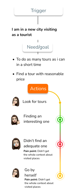
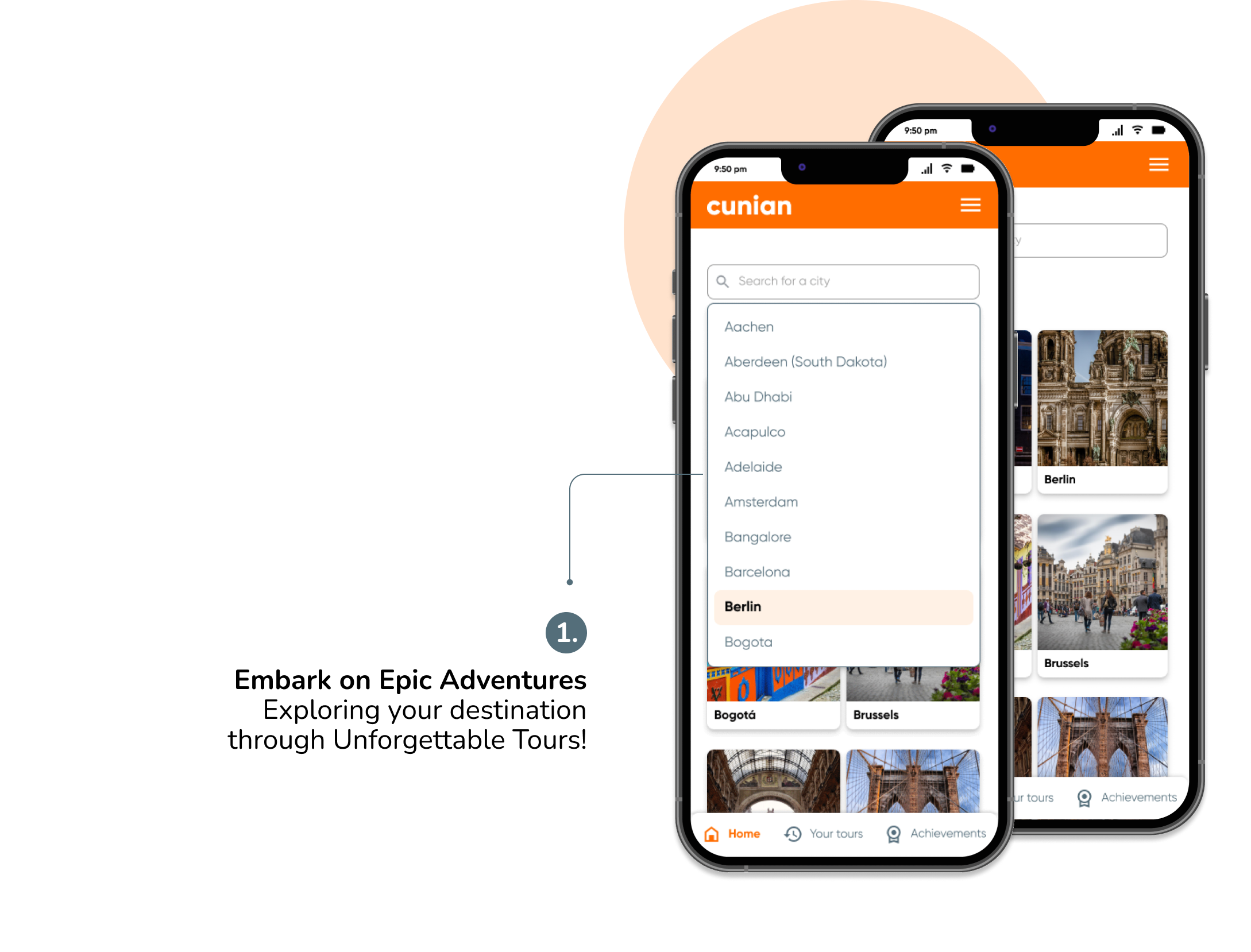
- When users went to travel destinations, the only way to do a guided tour, was by making a tour in person and with an adjusted time frame during the day. Users wanted to have more time flexibility when visit destinations without missing their tours of interest.

- When going to touristic places by their own, users didn’t get enough context about the places they visited.

My solution

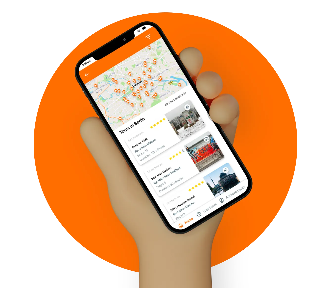
- Creating a platform where users can listen to the tours that they want to hear at anytime, without accommodating to the guide’s schedule, and do it on the pace that they want.

- The platform also works as source of documentation for users to revisit their previous tours and chat with the guide in case of any questions.

💎 DISCOVERY PROCESS

We did a product workshop with my client, to understand the business goals, identify user needs, collect and prioritize features, and create the design brief. My client had done a previous research done before creating the project, so this helped us to create the first draft.

1. Defining our target user
I created user personas to document the findings of the target customers based on previous interviews made by my client.
The most interesting thing I learned about users during the project was that users looked for tour solutions that accommodated to their traveling times and budget.

Mae Gutierrez

28 years old

Single

Recruiter

Motivations

New cultures

Learn  

Travel

Frustrations

Budget

Short trips

No variety

2. Shaping our user journey
I developed User Journeys based on the User Persona to gain a deeper understanding of the process they follow when traveling to a specific location.
Following my thorough analysis, it became evident that they face significant challenges when endeavoring to locate and engage with points of interest at their chosen destination.
These insightful findings have proven instrumental in guiding my understanding of precisely where to concentrate my efforts in both research and design. By delving into the challenges users encounter, I've garnered valuable information that illuminates strategic areas to enhance and refine the user experience.
 3. What's out in the market?
After finding our users pain points, i reviewed what is the state from current solutions on the market. In total i reviewed 4 tour booking platforms and how they approach the activity of tour booking. Here is a summary of the two most important competitors features analysed focusing on how they solve the user’s pain points. We analysed them to understand how which areas had gaps that could create value for users based on the user’s pain points.

👍🏽 Positive

- You can book a tour in advance
- You can rate a tour Tour integration to navigators (e.g. google maps)
- You can see how long is the tour (Duration + number of stops)
-The app shows profile of tour guide with tour description

👎🏽 Negative

- You must attend the tour is in person (no audio available)
- Once the tour has started, you can't join to the walk

👍🏽 Positive

- You can do do tours immediately
- Flexibility on times
- You can see how long is the tour (duration + number of stops)
- You can integrate your tour to navigators (e.g. google maps)

👎🏽 Negative

- There is not enough written description about tours or context about places to visit
- There is no companesation the tour guide

🌋 PROBLEM DEFINITION

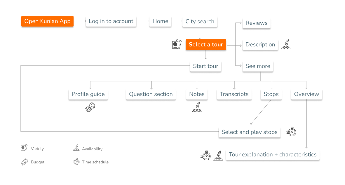
Once I had gained all the essential knowledge from the research phase (interviews insights, user journey and competitor analysis), i detected the pain points from this user persona, and formulated the problem statements.

I created user personas to document the findings of the target customers based on previous interviews made by my client.
The most interesting thing I learned about users during the project was that users looked for tour solutions that accommodated to their traveling times and budget.

I found these pain points

Budget
Not exciding the budget on their trip expenses
Time scheduling
Tour offers that fits their schedules and can be adjusted to their needs
Touristic offering
Be able to see as much of the touristic offering and learn about the city’s historical context

And here are the Solutions to address on my design

Payment flexibilities
Pay on a flexible way, based on what you can give
Availability
Tours available to be heard and revisited any time
Variety
Many options to choose from according to your preferences
User story
"As a traveler, i want to travel with an app that adapts to my flexible trips, schedules and economy, so that i am able to experience the most that i can from every city that i go to"

👋🏽 Problem Solution - Analyzing features design

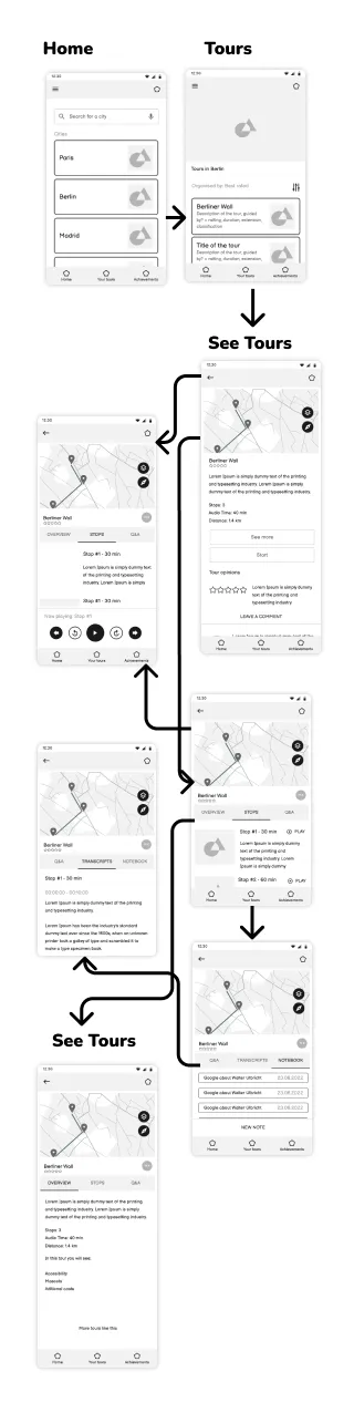
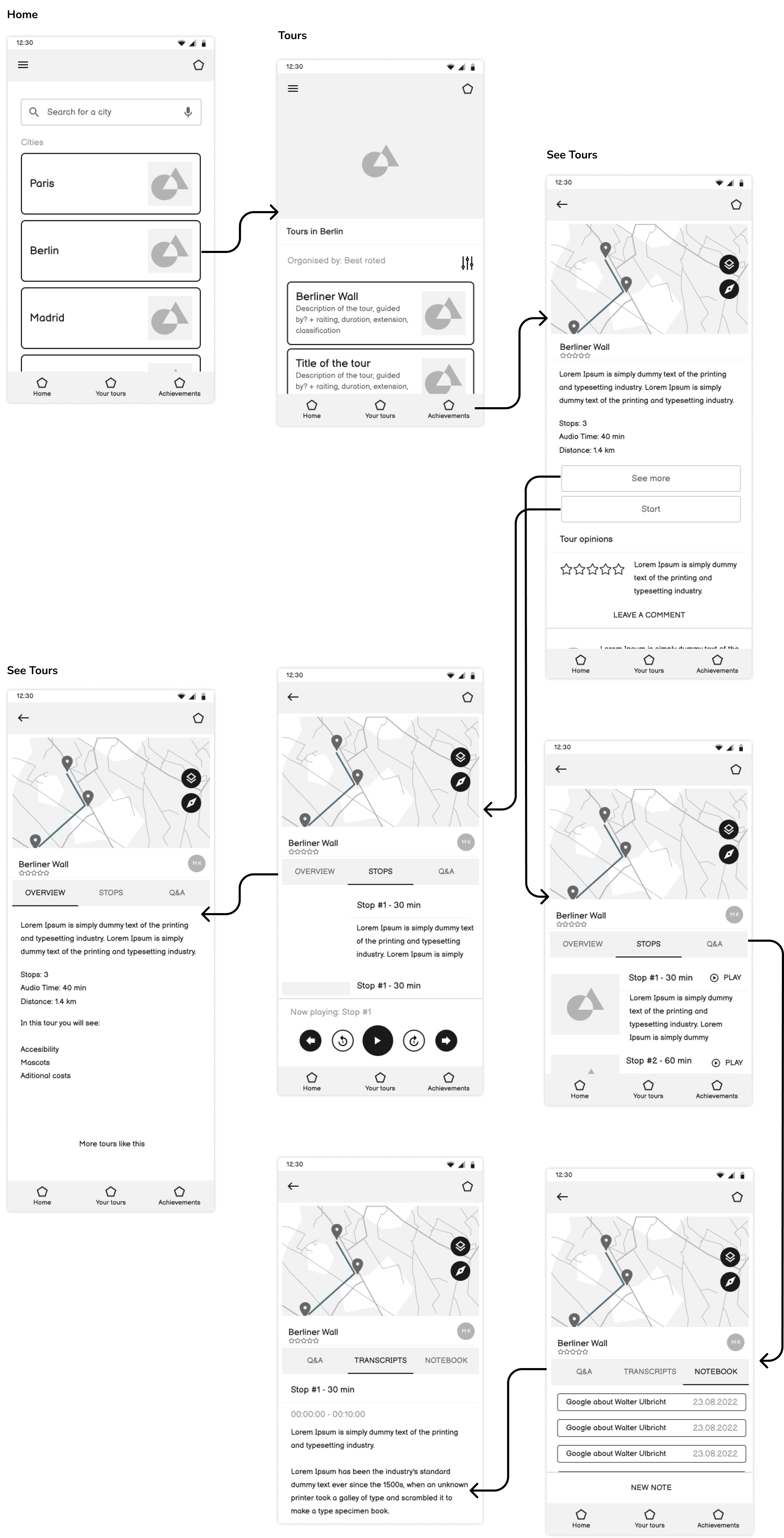
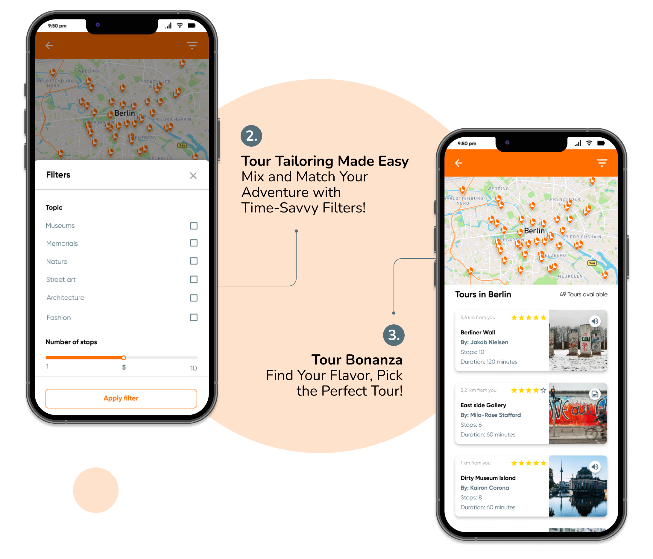
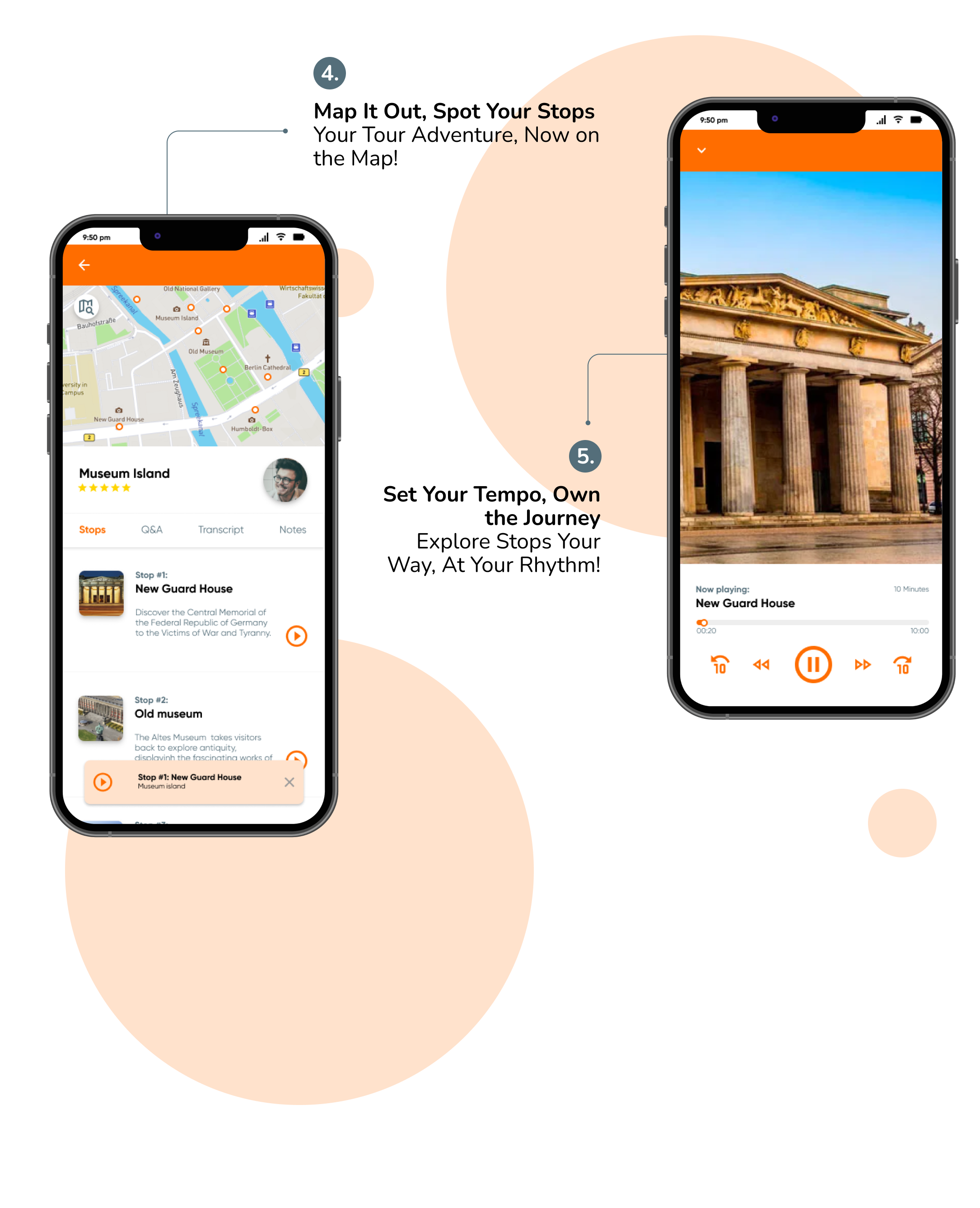
I had a brainstorm sessions to understand which features would solve the user’s needs, and what was the logical order to place those on the app. I mapped the user flows for the different features to understand how the users would follow tasks and interact with the them.

I explored sections like log-in, selecting and exploring tours, and rewarding the guide for the service. On the following example, i display the user flow for booking a tour on the app and indicate where the pain point would be solved. Other flows for gamification like achievements and tour history were also considered. After creating this mind map, i created the wireframes based on the user journeys, to later validate them with users.
Before diving into the visual designs, I started with Mid-fidelity sketches. This technique enables me to move fast and explore different ideas before settling on a direction. We discussed the sketches with the client, and in just 2 weeks, we had the backbone of the product after 2-3 iterations with users.This is the first Flow for the tour selection feature.
After validating the first flows and features with users i started to create the visual designs. I explored different visual directionsand created 3 Look and Feel designs. After presenting it to the client, we chose a visual design that reflected an adventurous lifestyle. The logo shows the foot of a tourist on the shape of a location pin, and the orange colour represents youth, optimism and encouragement.
I developed a design system for Cunian, aiming to establish consistency across the project. I organized commonly used elements like buttons, input fields, colors, typography, etc., into a versatile library that could be reused consistently across all design aspects. This approach is analogous to developers creating stylesheets and reusable components in React.

⭐ SUCCESS METRICS

I gathered with my client what would be success metrics once the final version of the app was validated and developed. These metrics would help us compare the app performance to the client’s business goals and come up with strategies/features to improve the app in the future.

App average rating and rating on tours
# of returning users
Percentage User churn rate
# Of downloads per month

Lets Connect!

Whether you have a project in mind or just want to chat about design, reach out!